Since our last post we had the chance to implement other features in the game.
I have been working in the cursor this past few days. It is a point-and-click after all. I’ve decided to built an entirely new cursor from scratch. Having in mind that the cursor must make clear its own functions (open, take, enter) and wishing for something different, I am thinking up of a color system to make these functions distinct. Some point-and-clicks I played use elaborate icons that indicate different functions, others simply don’t care about that at all. I want my cursor to react towards different objects and situations, but I wanted something more simple than intricate icons.
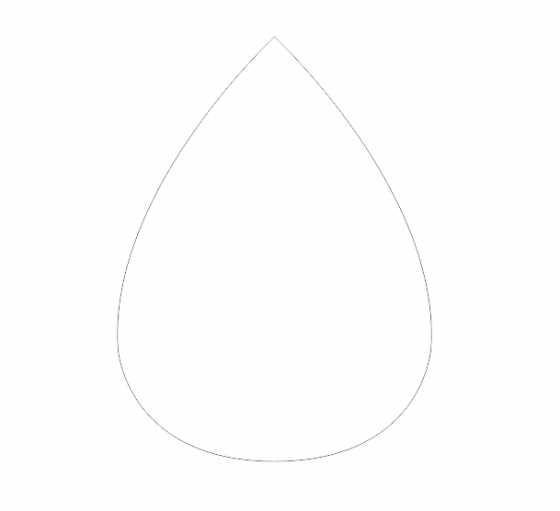
Well, here is one of my sketches:
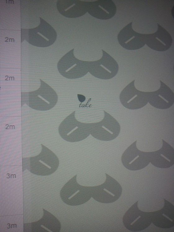
And here it is one of the cursors. I was testing it for two main aspects: if it feels natural and not awkward; if it seems bulky. I’ve tested it a lot, and so far it worked for me.
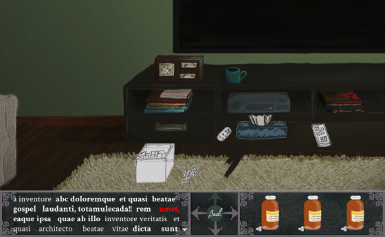
We are almost finished with the HUD. It will feature a text area, directional buttons and a simple menu.
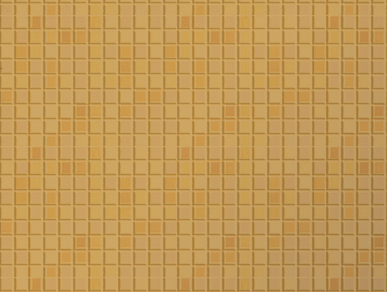
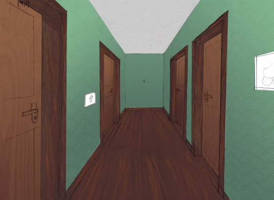
As for the art, I have been applying gradients and experimenting with textures, particularly tiled ones for the bathrooms, for example. I have also experimented some textures for the doors and baseboards.
Finally, we were mentioned in last week’s Teabag Or Die’s podcast! Our point-and-click is mention right at the beginning, in the show up section. To check it out, click on the link below:
http://teabagordie.com/2013/07/22/tbod-podcast-episode-19-return-of-the-red-eye/

 SuperSugoiSoftStudios DevDiary #01: First Steps
 SuperSugoiSoftStudios DevDiary #02: Building the Storyline
 SuperSugoiSoftStudios DevDiary #3: Taking shape
 The development of a blog
 DevDiary #5: Putting ideas into practice
 DevDiary #6: Towards post-production
 Simple, yet polished: COLOR is a great puzzle